Elevating the Digital Presence of a Design Thinking Agency
I redesigned and rebuilt Pensaar Design's website, moving it off a restrictive Squarespace template and reconstructing it in Wix, with an information architecture that finally matched how the agency wanted to be understood.
An early-career project, from before I joined TCS. I interned at Pensaar Design in Bengaluru in 2020 as a service design intern, and this website redesign was part of that work. I've kept it in the portfolio because its core lesson, that the structure of a site shapes trust before the visuals do, still holds up in the enterprise work I do now.
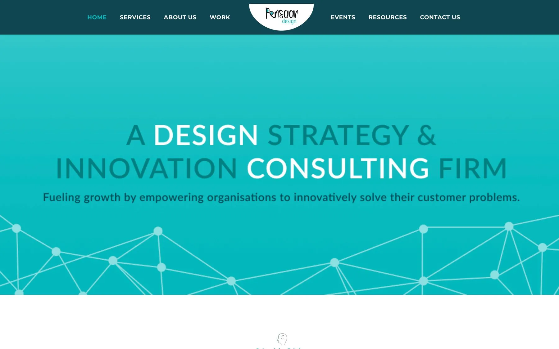
The platform was undermining the agency it was meant to represent
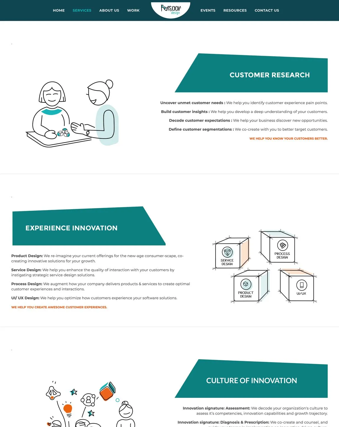
Pensaar Design's existing Squarespace website constrained their ability to showcase UX expertise. The template-driven platform limited how they displayed complex case studies, featured an outdated visual identity, and made it difficult for potential enterprise clients to navigate their services or understand their design philosophy.
The core tension: an agency selling human-centred design was using a tool that prioritised the template's constraints over the agency's communication needs.
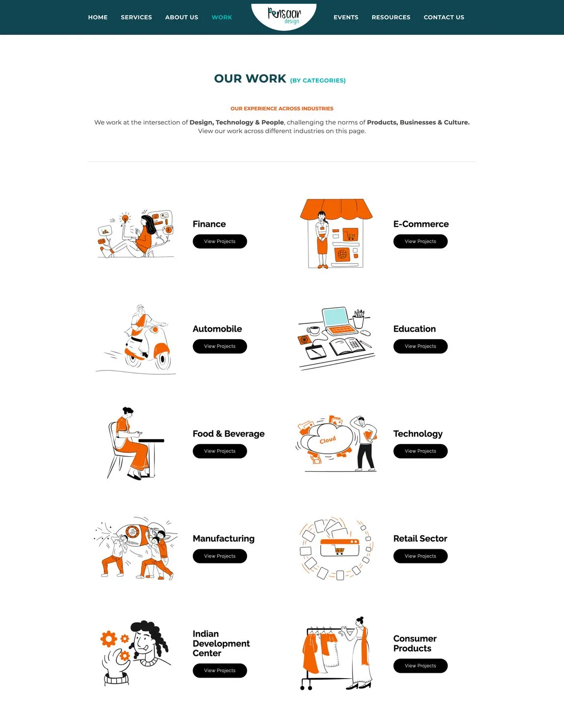
A site built to showcase the work, not just describe it
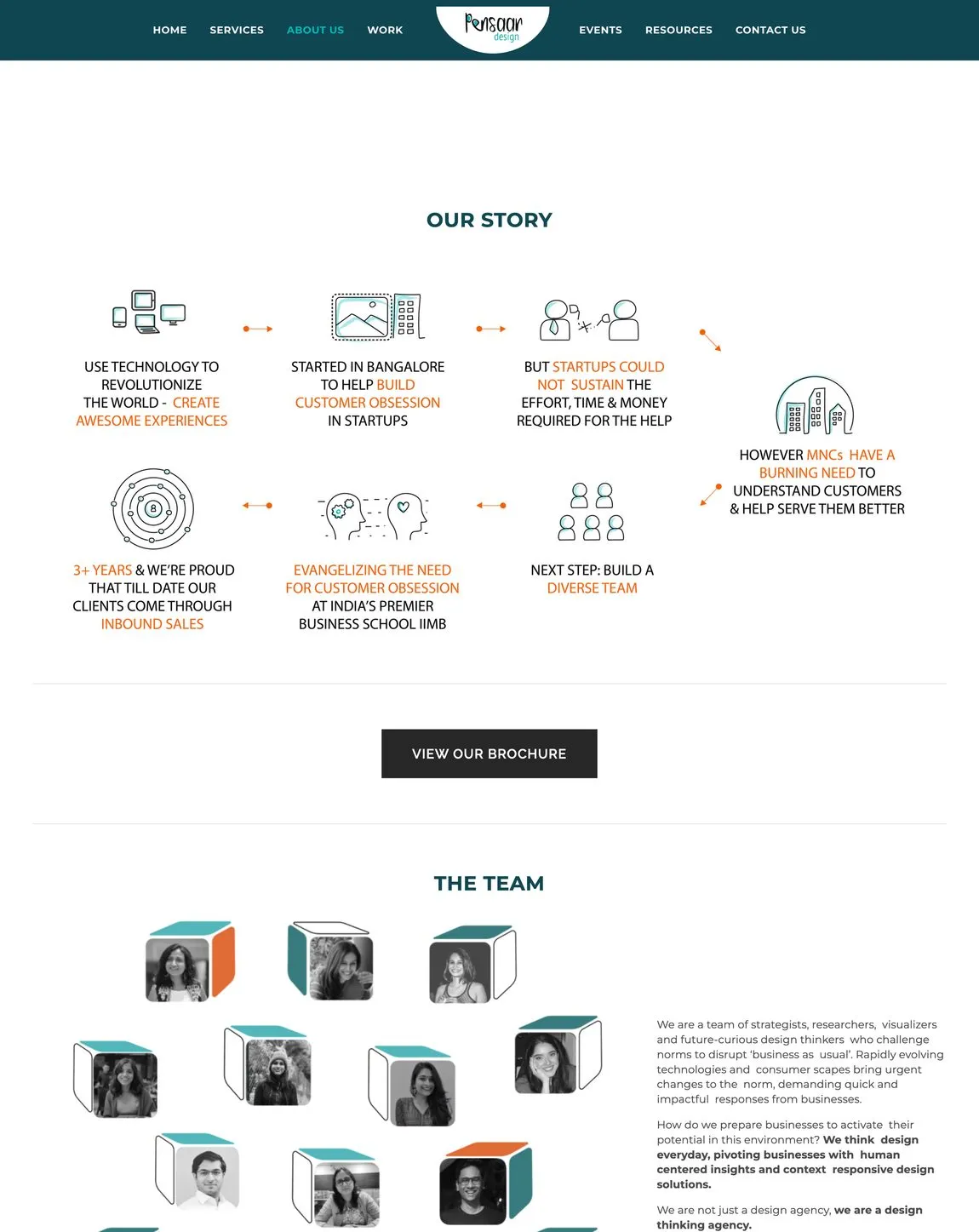
I redesigned the site and rebuilt it in Wix, hand-constructing every page, the navigation, and the responsive behaviour inside the platform. The new site introduced a more premium aesthetic, a navigation anchored to a clear discovery journey, and proper in-depth sections for case studies and methodology.
Delivering inside the CMS, rather than handing off a design file, meant the agency was left with a site their own team could run and update without a developer.
Designing the discovery journey for a consulting client
The single highest-impact change was the order of the navigation. The structure, not the visuals:
Pitch first. Buyers had to trust a price list before they understood the thinking behind it.
Thinking first. It mirrors how enterprise buyers actually evaluate an agency: who you are, what you believe, what you've done, what you offer.
A platform that works as hard as the agency does
The redesign gave Pensaar a site that worked for them rather than against them. Better structure and properly-presented case studies meant enterprise clients could follow the discovery journey as intended, and the metrics confirmed the navigation change was the right call.
What this project taught me
This project was a useful reminder that information architecture decisions are often more impactful than visual ones. The biggest improvement to the site came from restructuring the navigation, not from the visual redesign. Enterprise buyers evaluate an agency in a specific sequence: who are you, what do you believe, what have you done, what do you offer. The previous site inverted that order.
Six weeks is a compressed timeline for a full redesign and migration. On a project like this I'd push for at least one round of user testing with prospective clients before launch. We validated with stakeholders, not with actual buyers, which is a gap. The conversion-rate improvement suggests the architecture change worked, but we don't know what we may have left on the table.