UX Strategy for a B2B SaaS Platform in Industrial Safety
HAZOP Edge changed how safety assessments move through an organisation, not just how a screen looks. As the sole designer on the engagement, I redesigned the service behind hazard and operability studies in industrial environments: who does what, where accountability sits, how duplication and rework are removed, and how compliance evidence is produced. I owned it from the first domain research through to MVP delivery, alongside a parallel rebuild of the company website; the interface is the evidence of that service change.
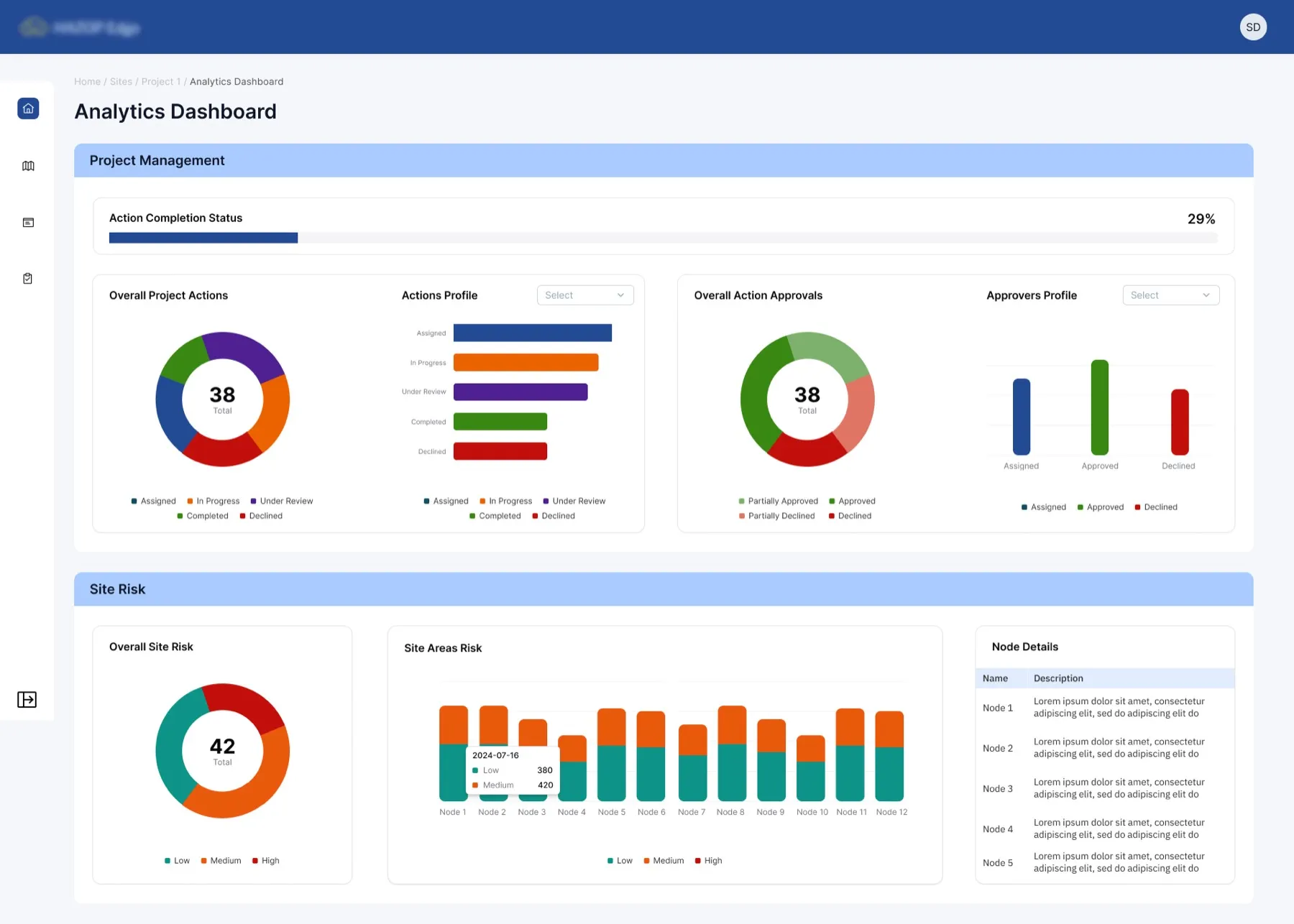
Complexity was the workflow, not a bug in it
Industrial hazard and operability (HAZOP) studies run on dense, technical workflows. The people doing them, process engineers, safety managers, risk analysts, needed a system that could manage rigorous, compliance-heavy work without burying them in convoluted interfaces.
The existing tools were built by engineers, for engineers. They were dense, unintuitive, and poorly suited to the cross-functional work a HAZOP study actually involves. Teams fell back on spreadsheets, Word documents, and email chains to track safety assessments that could decide whether a refinery was safe to operate.
UX strategy from domain research through MVP delivery
I owned the UX strategy across the whole project, translating dense technical requirements into something accessible. A scalable design system and a navigation structure anchored to the HAZOP lifecycle meant the MVP earned trust quickly, with safety professionals who had never had a tool built for this work.
The platform reduced manual data entry, standardised compliance reporting, and laid a foundation that the engineering team could build on without reintroducing inconsistency.
How I approached a domain I'd never worked in before
Industrial safety was entirely new territory for me. The first three weeks were almost all research, understanding the domain before I opened a design tool.
Domain research and stakeholder interviews
I ran in-depth interviews with safety professionals to understand the HAZOP study lifecycle, from identifying nodes through to tracking action items. The finding that shaped everything: safety engineers spent most of a study on data entry and format compliance, not on the safety analysis itself. The tool was meant to support the thinking, not replace it.
A service blueprint of the full system
I mapped the human and digital layers of a HAZOP study: the facilitator, the scribe, the engineers, the compliance officer. The service mattered as much as the UI. A study runs on handoffs between people, so the platform had to support those handoffs, not only individual tasks. The blueprint shaped the information architecture directly.
Information architecture and user flows
I structured the navigation around the four stages of a HAZOP study, Identify, Assess, Mitigate, Report, so users always knew where they were and what came next. Progressive disclosure ran throughout. Experienced engineers could go deep, while new users were not overwhelmed on first entry.
A design system for compliance environments
I built a design system covering components, states, content patterns, and accessibility standards. It gave the engineering team a foundation to expand on without reintroducing inconsistency. The visual language stayed deliberately calm. In a compliance environment, trust comes from predictability, not delight.
Prototype, test, iterate
I built high-fidelity prototypes and tested them with safety professionals. The main usability insight: during long, multi-node studies, users needed to understand the system status at every step. I refined the progress indicators, state labels, and confirmation patterns from the testing feedback.
"Safety engineers were spending over half of every study on data entry and report formatting, time that should have gone to the safety thinking itself."
Domain research finding · Soter Safety Consulting · 2025
Designing for trust in a compliance environment
The core design principle was reducing cognitive load. The goal was never simplification for its own sake. It was stripping out friction so users could focus on the safety thinking instead of fighting the tooling.
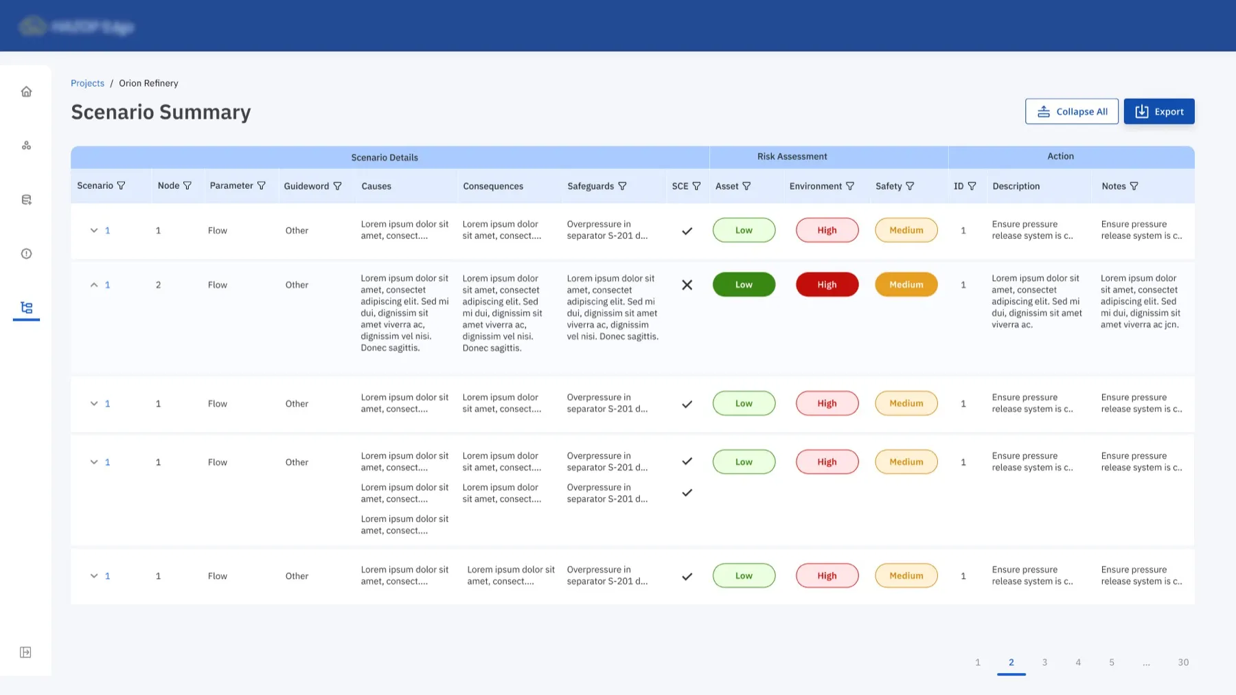
Lifecycle-anchored navigation
Navigation and page structure mapped directly to the safety assessment lifecycle: identify risks → evaluate operability → track mitigations → generate compliance reports. Users always knew their next step without asking a colleague.
Scannable layouts for data-heavy views
Risk matrices and technical safety logs used scannable, grid-based layouts with meaningful defaults and progressive disclosure. Seasoned engineers could go deep; first-time users weren't overwhelmed.
Consistent visual language
A deliberately calm, purposeful visual system. In compliance environments, trust comes from predictability, so status indicators, state colours, and confirmation patterns stayed consistent across every screen.
Scalable design system
A component library covering states, patterns, and accessibility, so the engineering team could ship new features without reintroducing visual inconsistency or breaking the trust model.
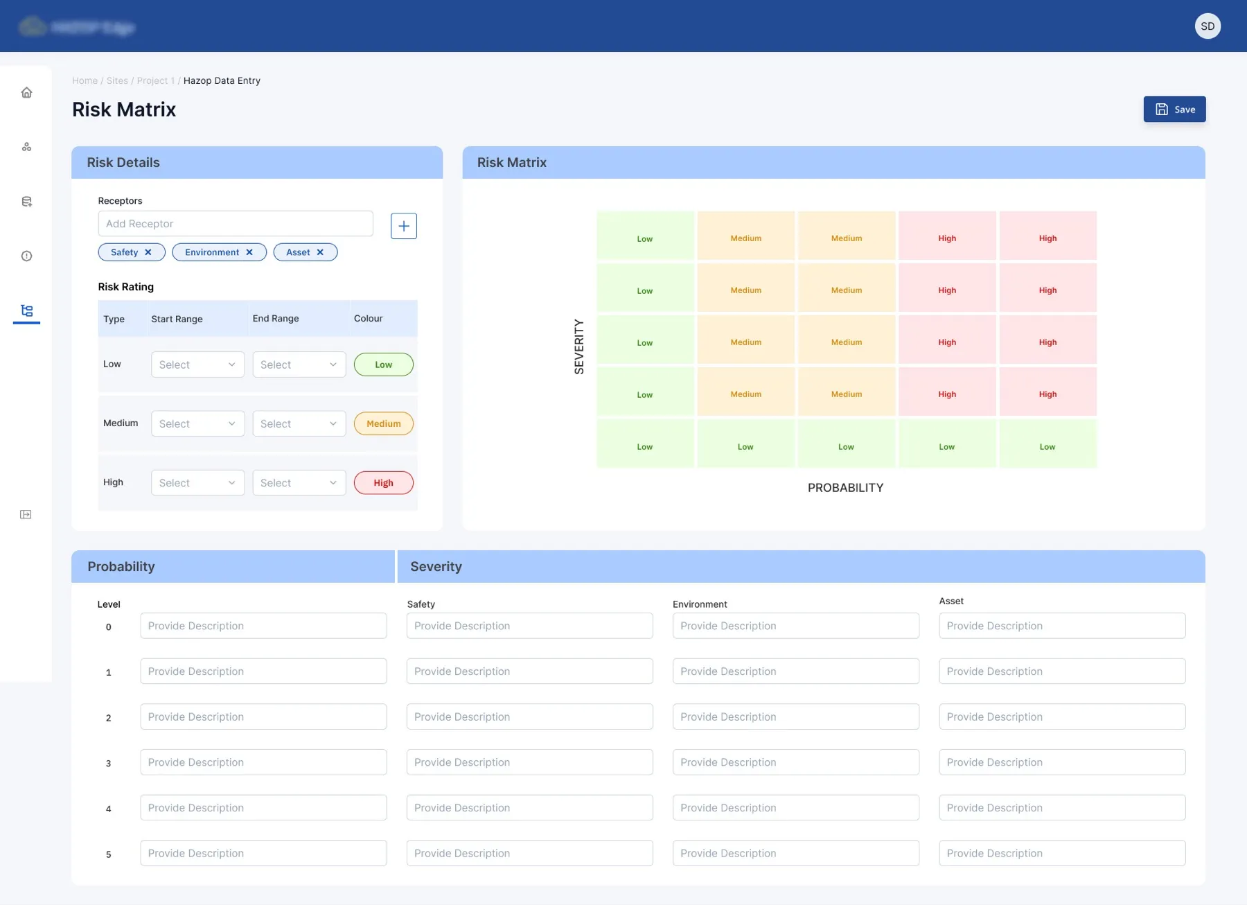
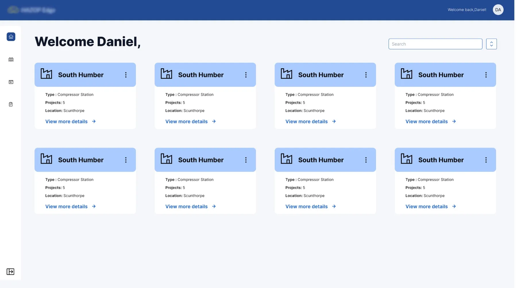
A safety assessment that moves through the organisation cleanly
The change was operational, not cosmetic. Studies that lived in scattered spreadsheets now move through one accountable process: clear ownership at each step, duplication and reporting rework removed, and compliance evidence produced as a by-product of the work rather than a scramble at the end. It maps onto how safety professionals already think, so it didn't try to replace the safety thinking, that part was never the problem.
Parallel engagement: rebuilding the company website
Alongside the HAZOP Edge MVP I rebuilt Soter Software's own website, migrating it off WordPress and into Wix. Same company, two outputs at the same time: a product platform their customers could trust, and a marketing site that could actually represent the company behind it. The website was the lighter brief, but its impact compounded the product, because every prospect now landed in the right place before the demo.
A WordPress site that under-sold a serious product
The existing site read like a brochure: a long homepage, a thin About page, and a Products page that listed features without explaining who they were for. Two compounding issues. The information architecture did not match how engineering buyers evaluate process-safety software, so visitors bounced before they understood the product. And every content change needed a developer, so marketing couldn't keep the site current with the roadmap.
A site that maps to how buyers actually evaluate
I rebuilt the information architecture around six top-level sections, each answering a specific question a process-safety buyer brings to the site, and organised the Products page by the four personas who touch a study. I delivered it inside Wix, hand-building every page, the navigation, and the responsive behaviour, so the team was left with a site they could update themselves. Zero developers needed for content changes.
- 01HomeWhat does this company do?
- 02AboutWho's behind this, and can I trust them?
- 03ProductsWhat does HAZOP Edge do, and is it for me?
- 04Knowledge CentreHow do these people think about safety?
- 05FAQsWhat's the catch, what does it cost, how does it deploy?
- 06ContactI'm in. How do I talk to a human?
Each section earns its place by answering one question. The Knowledge Centre, in particular, was a deliberate addition. Buyers in process safety read before they buy, and giving them a place to read built credibility before any sales conversation.
A product page that speaks to four people at once
HAZOP Edge is used by four very different people on the same study. The old page listed features in one long flow, leaving each persona to find their own relevance. The rebuilt page is structured by user role, so each visitor finds their own job described in their own language within the first scroll of their section. It also gave the sales team a cleaner share artefact: drop one persona-anchored section into a follow-up email rather than sending a deck.
Facilitators & Scribes
Set up workshops, document decisions, cut manual rework.
Team Members
Access studies, collaborate live, see risks in context.
Project Managers
Real-time dashboards, bottleneck visibility, consolidated insights.
Senior Management
Risk trend visibility, data-driven decisions, compliance evidence.
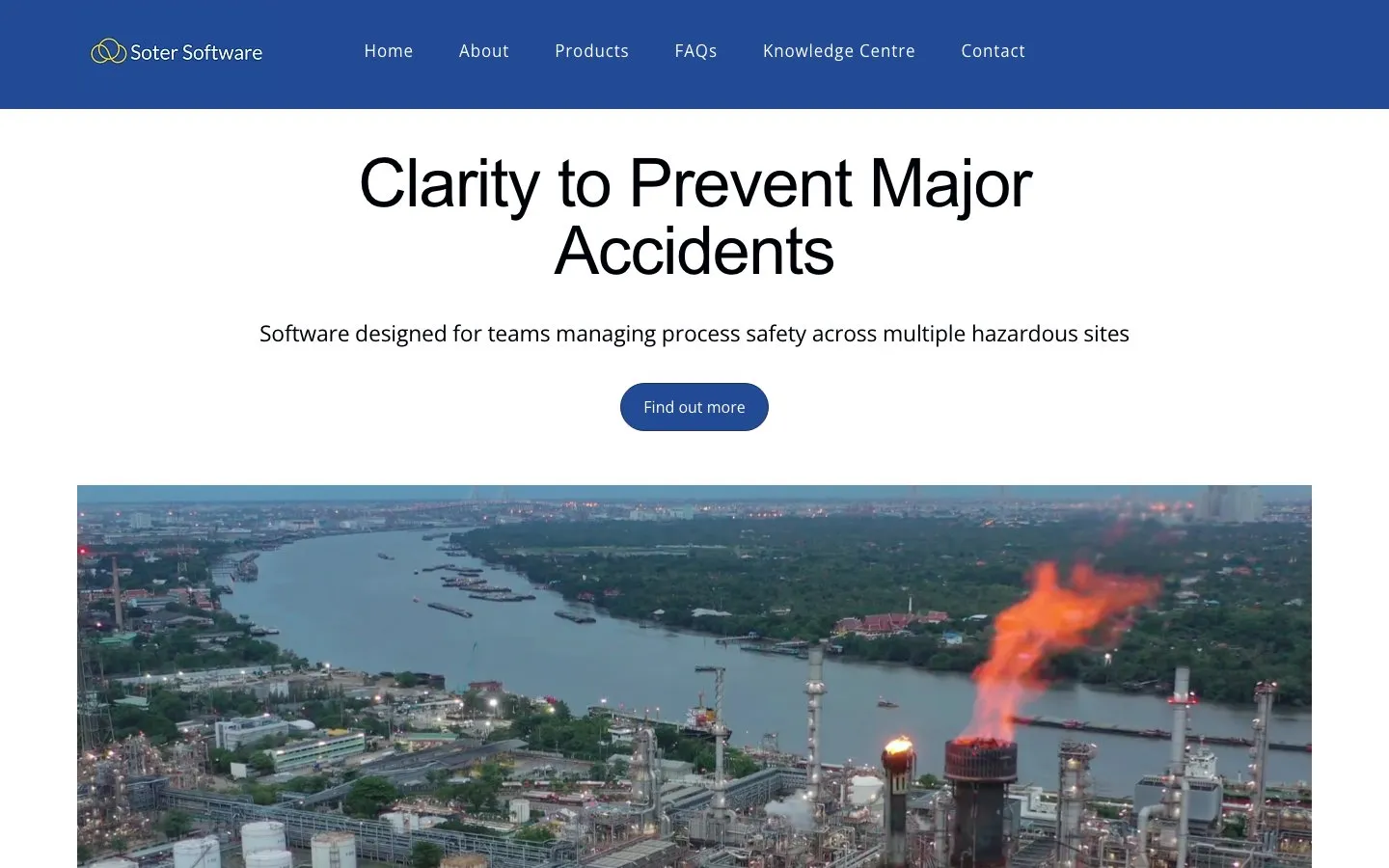
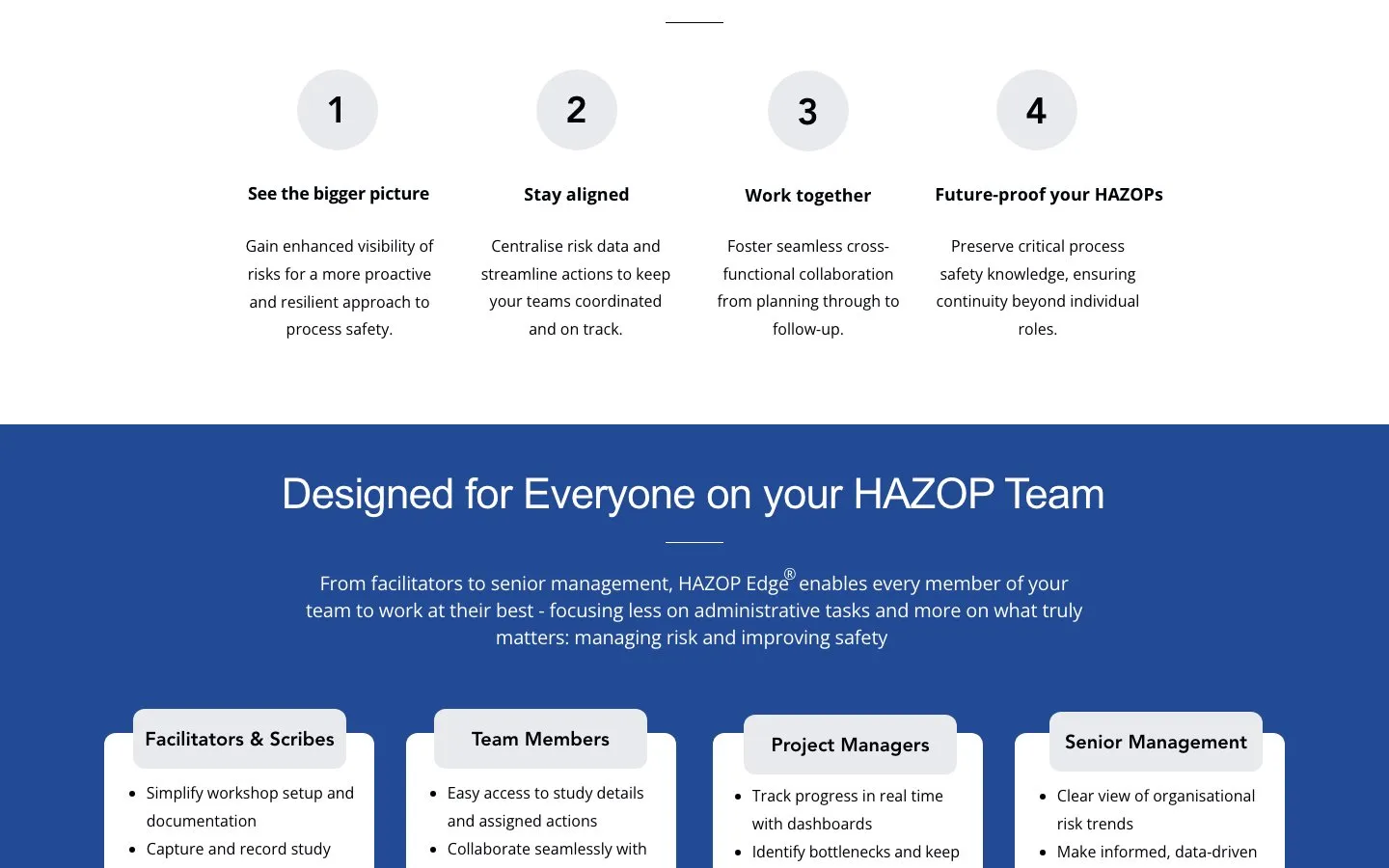
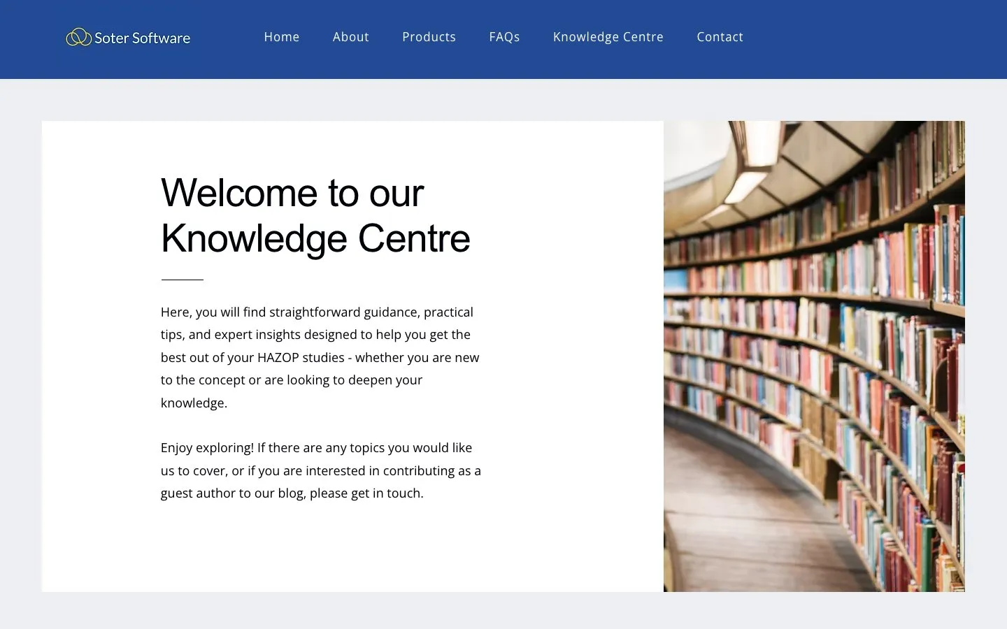
Wix wasn't the fashionable choice, and it wasn't meant to be. Soter's team is small and fast, and they needed a surface they could run themselves. A custom build would have looked better in a portfolio and worked worse in the business. Choosing the boring tool was the design decision.
What this project taught me
Working in industrial safety forced me to confront the limits of pattern-matching. Most of the UX patterns I'd built up over several years of enterprise work were only partly useful here. Safety professionals have a very specific mental model, shaped by regulatory frameworks and a deep risk-aversion, and a lot of consumer-influenced design patterns work against it.
The domain research, which I almost compressed under timeline pressure, turned out to be the most valuable work I did. The service blueprint session with stakeholders surfaced requirements that no amount of user-story refinement would have uncovered.
If I revisited this project, I'd push harder for at least one round of usability testing with safety engineers in their own context, with a screen recording rather than a facilitated lab session. HAZOP tasks are long and sequential, and lab-style sessions are poorly suited to validating that kind of flow.
I'd also bring accessibility constraints in earlier. In a compliance environment, accessibility is a legal requirement, not a nice-to-have, and retrofitting it later created rework I could have avoided.
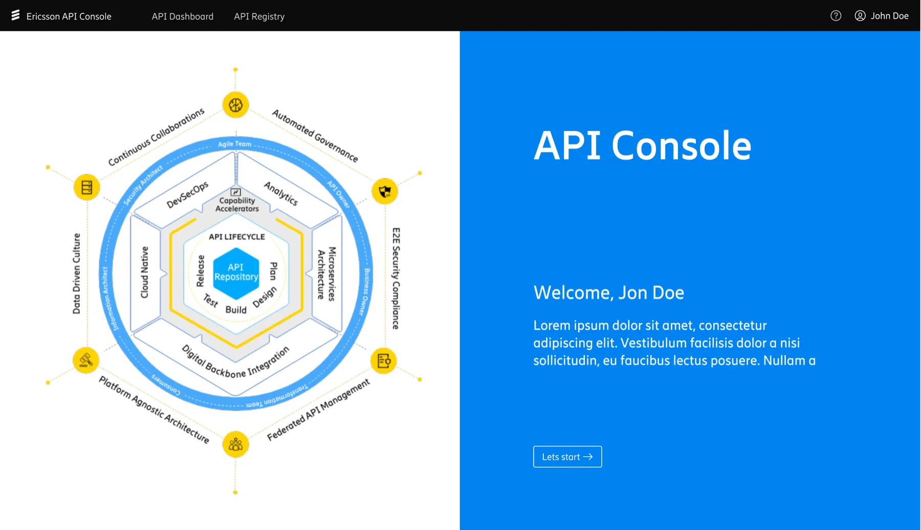
B2B SaaS · IT · 2020-2023
B2B SaaS API Console · Ericsson
File Architecture
Scattered files across OneDrive and Teams, rebuilt into one numbered, navigable system the whole team could use.
Research Templates
Shared templates for interviews, insight decks, and stakeholder presentations, no more starting from scratch.
Handoff Process
A five-step handoff so research findings reached design as a starting point, not an afterthought.
Design Ops · Sherwin-Williams · 2024
Building Design Operations at Scale
Speculative Design · Rodd Design · 2025
Amble, a Speculative Service Design