Designing a B2B SaaS API Console for Ericsson
I led product design and built the design system for Ericsson's Scaling API vertical, a B2B SaaS suite centred on the API Console where developers built, configured, and managed APIs. Three interconnected products, one design ecosystem, across a three-year engagement that took me from product designer to design lead.
This is enterprise client work for Ericsson, shown for portfolio review. The focus throughout is the system, the process, and the leadership, not the screens.
Three interconnected products. One design ecosystem.
The vertical began as an internal B2B tool for Ericsson's own developers. Stakeholder research identified a market gap: the product could be sold externally, to enterprise API clients. The scope shifted, and the design had to scale to match.
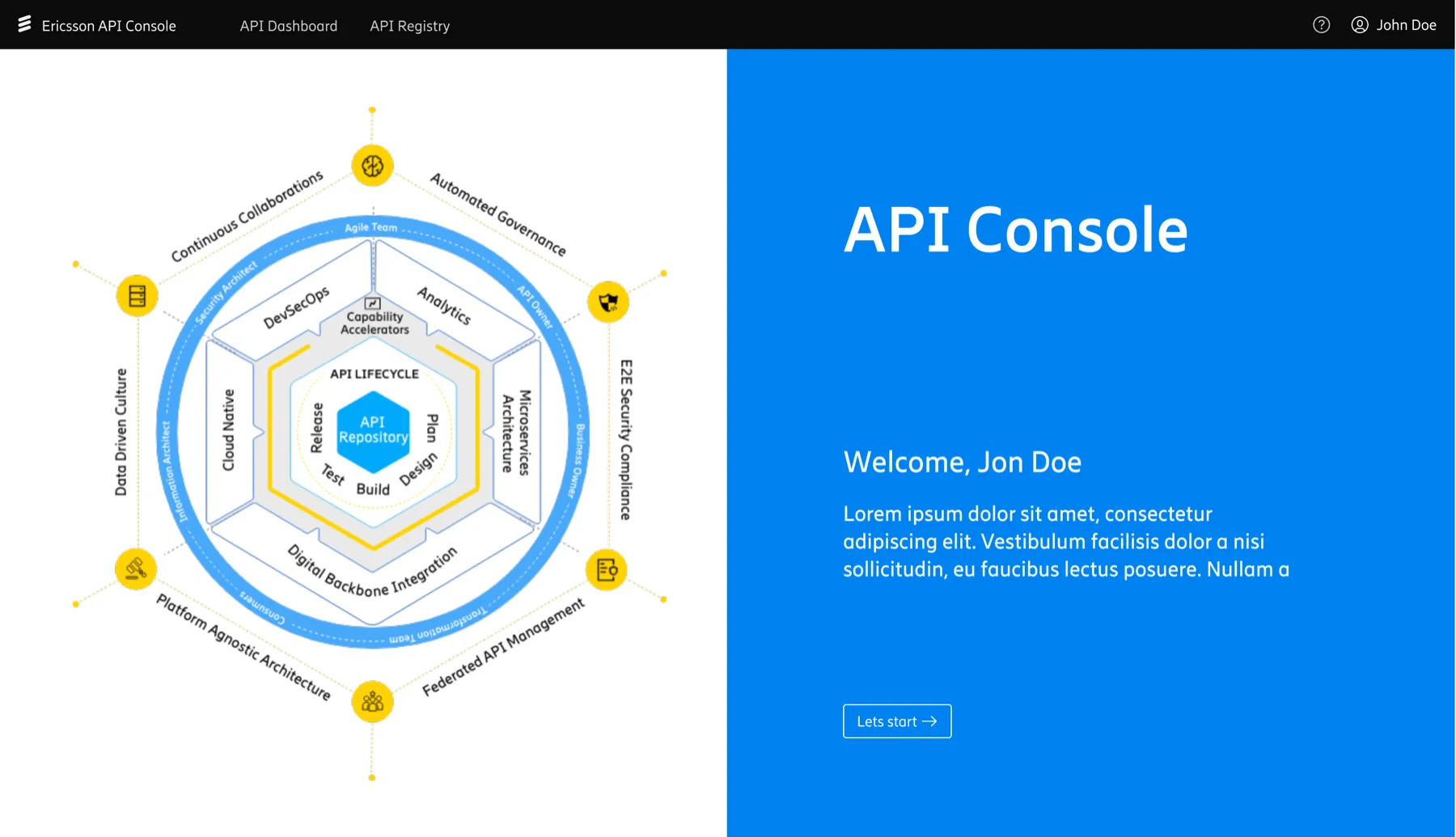
API Console
The primary creation environment where developers built, configured, and managed APIs. The most complex product in the vertical, and the hub everything else depended on.
API Portal
The external-facing interface where developers discovered APIs, accessed documentation, and onboarded. First point of contact for new users entering the ecosystem.
API Marketplace
Where APIs could be listed, discovered, and accessed by external enterprise clients. Enabled the commercial pivot from internal tool to sellable product.
All three products shared components, interaction patterns, and user flows. A change in one had downstream effects on the others.
Three products, zero visual consistency
No shared design language
Each product had been designed independently. The same actions looked and behaved differently across Console, Portal, and Marketplace. Users moving between them had to relearn basic interactions.
Ericsson's system, applied inconsistently
The main Ericsson design system existed but had not been applied systematically to the Scaling API vertical. Some components followed it, others diverged. There was no clear ownership.
No foundation for scale
With the external B2B pivot, the product needed to be presented to enterprise clients. Inconsistency that was tolerable internally became a credibility problem externally.
Adobe XD with no governance
Design files existed in Adobe XD but with no structured component library, no naming conventions, and no documentation. Every designer made local decisions without a shared reference.
A design system built for a vertical that needed to evolve
The goal was not a rigid system. It was foundations solid enough that designers could keep changing things over time without losing consistency. I built it on top of Ericsson's existing design system, adapted for the specific needs of API tooling.
- Colour tokens aligned to Ericsson brand
- Typography scale for UI density
- Spacing system on a 4pt grid
- Iconography set for API concepts
- Elevation and shadow standards
- Data tables for API response display
- Navigation patterns across products
- Form elements and validation states
- Status indicators and badges
- Code display and syntax blocks
- Modal and overlay patterns
- Empty states and error handling
- Component naming conventions
- Version logic: base to variant
- Adobe XD library structure
- Figma transition handoff guide
- Component logic documentation
- Ownership and update protocol
Figma became available near the end of my tenure. I restructured the file architecture and wrote a handoff guide so the transition would not lose what had been built.
From three islands to one system
- API Console
- Custom nav, dense tables, no pattern docs
- API Portal
- Different colour usage, unique button styles
- API Marketplace
- Inconsistent spacing, its own icon set
- Shared elements
- None, every decision made locally
- Documentation
- None, designers held knowledge in their heads
- New-designer onboarding
- Start from scratch, reverse-engineer decisions
- Shared token system
- Colour, spacing, type consistent across all 3 products
- 10-15 core components
- Built once, used everywhere with documented variants
- Consistent interactions
- Same action = same pattern, regardless of product
- Component library in XD
- Single source of truth, linked across product files
- Figma handoff guide
- Component logic documented for a smooth transition
- New-designer onboarding
- Open the library, read the docs, start contributing
No business analyst on the team, so I became one
The team lacked a dedicated business analyst. As the most experienced person on the project, I took on the work of translating between Ericsson's product owners and our design and engineering team. This happened repeatedly across the three-year engagement.
PO had ambitious scope
Product owners came with large feature ideas. Genuinely good thinking, but beyond what the team could deliver within the timeline, budget, and technical constraints of that version.
Find the workable middle
I would acknowledge the idea properly rather than dismiss it, then take it to the tech lead, pressure-test what was actually buildable, and come back with a version both sides could accept.
Agree now, design for later
The team delivered an agreed feature set for the current version. I created design concepts for the fuller vision, logged in the roadmap. The PO left satisfied. The idea was parked responsibly, not killed.
This required requirements gathering, workshop facilitation, and the ability to hold a position under pressure while keeping both sides feeling heard. It was design leadership, not just design craft.
From doing the work to making it possible for others
What actually changed:
The product shipped. Both sides were satisfied.
Shipped on agreed scope
Every version delivered what was committed. Disagreements were resolved before they became blockers.
External B2B pivot supported
The design system gave the product credibility with enterprise clients. Three inconsistent tools became one coherent platform.
Built to outlast the team
The system was documented so new designers could onboard without losing what had been established. The Figma guide meant the work survived the tooling change.
What I'd do differently, and what this made me realise
Involve the team in the system earlier
I built a lot of it myself before sharing. In hindsight, getting designers to co-create components from the start would have created faster adoption and stronger ownership. The system was good. The rollout could have been more collaborative.
Where design actually creates value
The moments that mattered most were not the screens I designed. They were the conversations I facilitated. Getting a PO and a tech lead to a shared view of what was possible in a release mattered more than any individual design decision.
This is what moved me towards design operations
By the time I left this engagement, I was spending more time on systems, processes, and cross-functional alignment than on hands-on design. That transition felt natural, and it led directly to the Sherwin-Williams design operations engagement. I had already been doing the job before it had the title.
File Architecture
Scattered files across OneDrive and Teams, rebuilt into one numbered, navigable system the whole team could use.
Research Templates
Shared templates for interviews, insight decks, and stakeholder presentations, no more starting from scratch.
Handoff Process
A five-step handoff so research findings reached design as a starting point, not an afterthought.
Design Ops · Sherwin-Williams · 2024
Building Design Operations at Scale
Concept · Premium Fintech · 2025
KinVault Heritage, a Digital Vault-Atelier
- 01 Home
- 02 About
- 03 Products
- 04 Knowledge
- 05 FAQs
- 06 Contact
Web Redesign · CMS Migration · 2025
Rebuilding a Process-Safety Web Presence