Designing a Voice-First AI Companion for Older Adults
miiGenie helps older adults live independently while giving family carers confidence from a distance. I joined as the founding and sole designer when the product was a working Flutter build without a design identity, working in a three-person product, engineering and design team reporting to the founders. I have been giving it an identity since: a system, a voice, and an experience calm enough for a 75-year-old to trust.
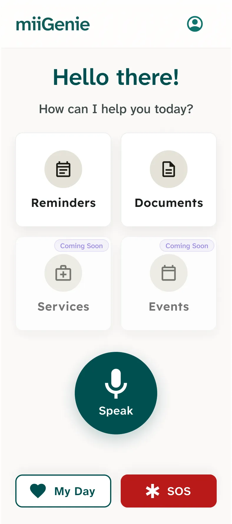
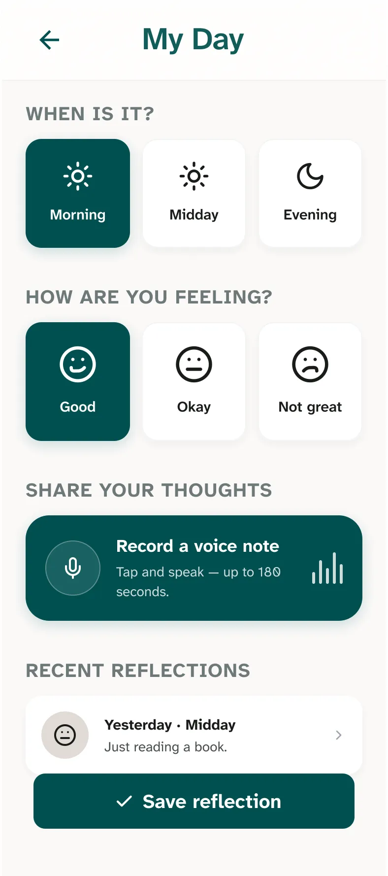
"Just say it, miiGenie takes care of it." The product's whole promise is helping older adults age in place: stay organised, stay connected, and get support at home without adding digital complexity. This is a live engagement, written from inside the work. The MVP is design-complete and entering production; a fuller case study with pilot results will follow once the first users are in. What is here is already true: the research, the system, and the decisions.
Smartphones quietly assume a user who isn't 75
Older adults want to stay in the homes they know, but daily life gets harder to manage over time. The research surfaced the same three failures again and again: missed appointments, activities and medication; a constant coordination burden landing on family carers; and digital tools that feel confusing or impersonal. Most apps assume steady hands, sharp eyesight, fast reading, and a mental model built from twenty years of software. Many older adults have none of those.
The existing "senior app" category mostly patronises: huge buttons wrapped around stripped-down features, designed as if ageing meant losing the right to a capable product.
Voice-first, never voice-only, and two users at once
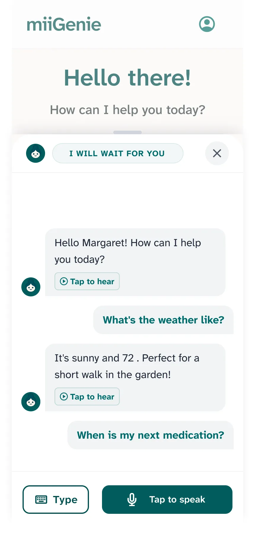
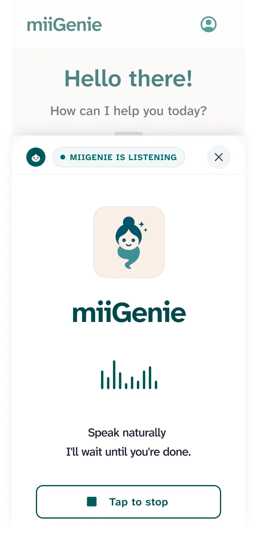
miiGenie leads with the one interface older adults already master: talking. Every core job, reminders, finding a document, recording how the day went, calling for help, can be done by speaking. And every voice step has a typed fallback, because dignity means never being stuck.
The second design surface is the family carer: pairing, check-ins, and visibility designed as reassurance rather than surveillance. The product is deliberately framed as supportive everyday companionship, with hard guardrails: it is not a therapist and never pretends to be a relationship.
The product I inherited worked. It didn't speak.
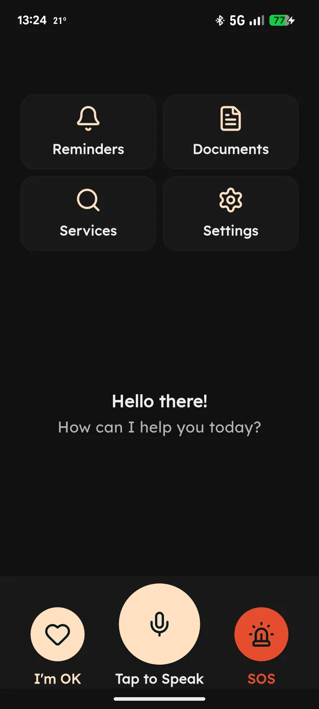
When I joined in March 2026, the engineering team had already shipped a functional Flutter build: registration, a voice loop, reminders. What it lacked was an identity. Emoji stood in for icons, components varied screen to screen, error states dead-ended, and nothing about it said "built for you" to a senior. My first job was not drawing screens, it was giving the company a design function: a visual language, an accessibility baseline, a Figma system the developers could actually build from, and a review rhythm so quality survived contact with the sprint.
A visual language with a temperature
Warm cream surfaces, deep teal actions, generous type. Calm over clever, familiarity over fashion.
An accessibility baseline, not an afterthought
WCAG AA contrast, 48dp minimum touch targets, large-font resilience, and copy written for reading ease.
A component library the team builds from
Every flow specified with its edge states in Figma, so what ships is what was designed.
Five people the product has to work for
Grounded in 50+ interviews and conversations with seniors and carers across Hampshire, with MVP priorities set through co-design sessions and pilot onboarding now underway. The research distilled into five personas across the two roles, and a journey map for each role from first awareness through to retention. The personas are not demographics, they are relationships to independence: each one wants to stay capable, and fears the moment technology proves they aren't.
Living alone, away from family
Wants to run her own life: medication on time, paperwork in order, family a tap away. Anxious that technology will make her feel stupid.
Recently moved, network lost
New town, old habits gone. Wants to rebuild a routine and a social circle without depending on the family he moved closer to.
Prefers their own company
Independent by choice. No interest in community groups; wants appointments, documents and health admin handled without fuss.
The busy family carer
Sandwich generation. Helps parents with life admin from a distance while raising children. Needs visibility without surveillance.
The working caregiver
Caring for a parent while still working full-time. The app has to be self-explanatory, because she has no spare hours to be tech support.
The senior journey, and what the design does about it
- 01 Awareness
Hard to gauge whether a tech brand can be trusted at all.
A warm, human identity, and a carer-led introduction path so the first contact comes from family, not an advert.
- 02 Consideration
Comparing apps is exhausting and time-consuming.
One clear promise, practical daily help, instead of a feature list.
- 03 Trial
Fear of being harassed for feedback or trapped by a card on file.
A one-month trial on phone-number registration alone. Feedback is gathered in context, never by ambush.
- 04 Purchase
Working out what the app costs, and when, is genuinely confusing.
The subscription page states the trial end date and terms in plain sentences before any commitment.
- 05 Service
Subscription tiers written for marketers, not for seniors.
Two tiers only, each explained in words rather than a comparison matrix.
- 06 Retention
Deciding whether the app deserves a place in their life.
The app earns it through routine: reminders that fire, documents that surface, a day that feels held together.
Three principles the research made non-negotiable
Privacy comes first
Trust is the biggest barrier to adoption. Older adults need to feel in control of their data, supported by transparency, non-intrusive design, and a trusted, family-involved onboarding.
Benefits must be obvious
Adoption improves when the value is simple and immediate. Real-life use cases help users see exactly how the product fits their day, with no learning curve to climb first.
Technology should support, not replace, connection
People want tools that strengthen relationships, not substitute for them. Every feature is pointed at communication and community, never at keeping someone on a screen.
Voice-first, never voice-only
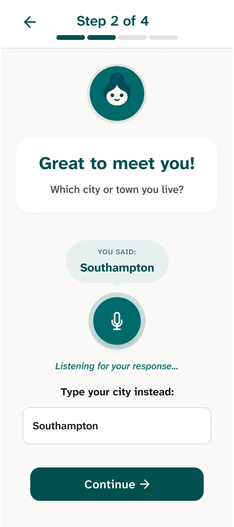
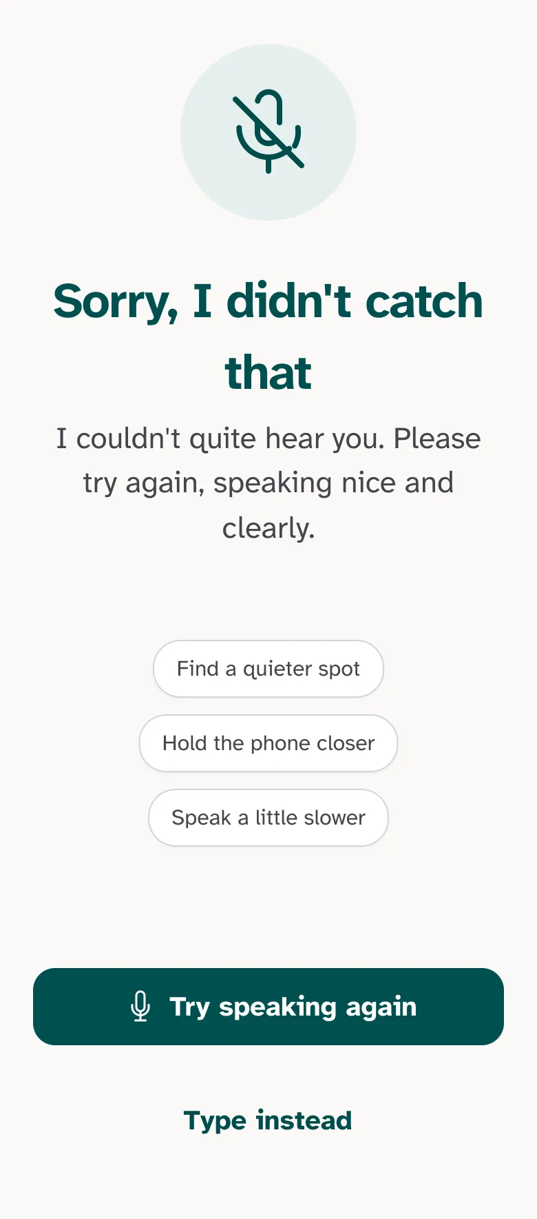
Voice is the interface older adults already know, but it is also the one that fails most publicly. So the voice loop is designed around patience and forgiveness: the app waits without a countdown, every voice step offers "type instead", and a failed attempt produces help rather than a dead end.
Reassurance for the carer, without surveillance of the senior
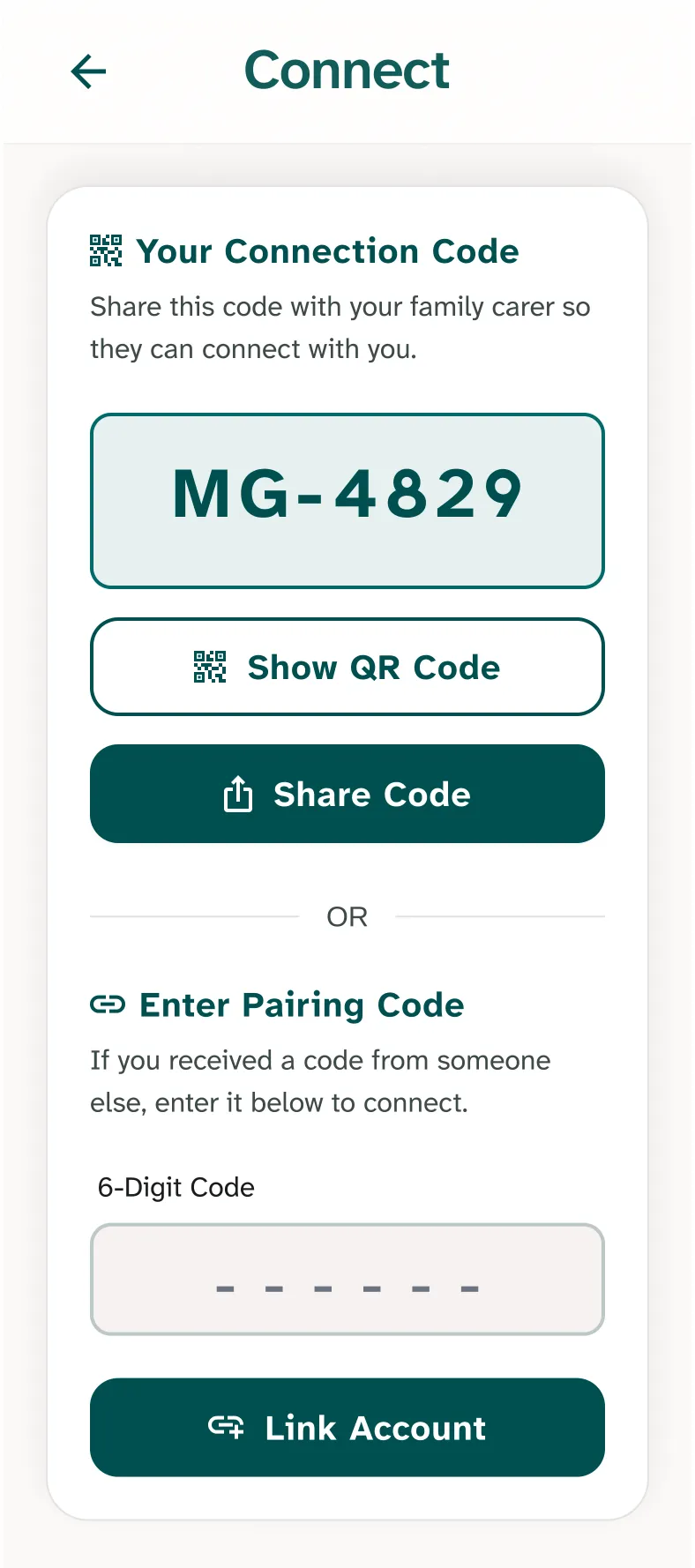
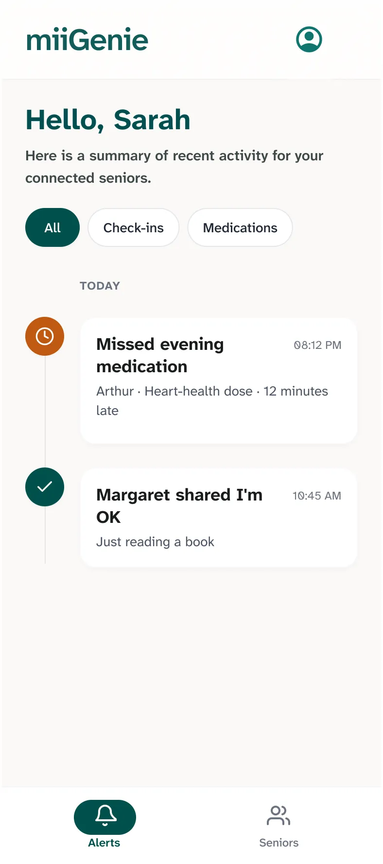
The carer side is its own product surface: pairing by a short code or QR, a feed of check-ins and missed medications, and profile management for the senior they support. The design line I held throughout: the senior is the user, the carer is the safety net. Visibility is framed as "Margaret shared I'm OK", never as monitoring.
Four everyday jobs, one calm surface
Underneath the voice layer, miiGenie does four practical things. Each was designed with the same forgiving pattern: real help, presented simply enough that a tired 75-year-old can act on it the first time, every time.
Remind
Appointments, medication, routines, and gentle daily prompts.
Organise
Important information and documents in one accessible place. "Find my gas bill from January" works by voice.
Connect
Family check-ins, reassurance, and easier communication, both ways.
Support
Access to trusted local services and practical help around the home.
Design-complete, entering production
MVP 1.1 is design-complete and the build is being brought up to the approved system for a production release this month, followed by a pilot with first users. The next chapter of this case study writes itself from there: onboarding completion, voice success rates, and whether the trial-to-subscription moment reads as honestly as it was designed to.
What being a founding designer actually means
The job is only half screens. The other half is building the company's relationship to design: specs engineers can implement without guessing, a review rhythm that catches drift before it ships, and the patience to explain why an emoji is not an icon. A design system nobody follows is a portfolio piece; one the team builds from is infrastructure.
Designing for older adults has sharpened every instinct I have. The disciplines it forces, one idea per screen, errors that forgive, copy a tired person can read, fallbacks for every modality, are not "senior design". They are just good design, measured against the hardest grader there is.