KinVault Heritage, the Digital Vault-Atelier
A self-initiated concept for a premium cross-border finance app, one that treats sending money home as an act of family care, not a transaction. KinVault Heritage pairs the permanence of heritage banking with the speed of modern remittance: shared family vaults, AI-timed transfers, and direct international bill payment.
A self-initiated concept project, not a client engagement. I built it to explore product thinking in premium consumer fintech, a domain distinct from my enterprise B2B work. The research, brand direction, and metrics draw on publicly available data and self-directed user research; the figures are directional targets, not live product data.
Remittances are transactional. Families aren't.
Cross-border remittances are a high-frequency, high-trust activity for millions of diaspora families, yet most transfer apps treat them as simple one-way transactions. There's no shared context, no family visibility, no way to save towards a shared goal, no way to pay a bill directly for someone you're supporting from another country.
The result: anxiety at the point of transfer (is the rate good right now?), uncertainty at the receiving end (did it arrive? was it enough?), and no mechanism for building the kind of shared financial trust that families actually operate on.
And there's a positioning gap. The apps that move money fast feel disposable and transactional. The institutions that feel permanent enough to trust with family money, the heritage banks, are slow, opaque, and built for individuals rather than families.
A Digital Vault-Atelier: vault-grade trust, made for families
KinVault Heritage reframes the transfer as a relationship. Its north star is the Digital Vault-Atelier: the security and permanence of a private vault, delivered with the bespoke, considered craft of a studio. Families connect through "Kin-Link", a trusted, person-to-person rail, then operate shared vaults both sides can see and contribute to.
Three capabilities sit on top: AI-driven rate triggers that take the anxiety out of timing, direct bill payment so a sender can settle a utility without the money being redirected, and real-time status both ends can watch.
The design principle: every feature reduces a specific anxiety in the transfer relationship, whether uncertainty, opacity, or mistiming, rather than just adding functionality.
Research-led, prototype-validated
Informal interviews with 6 diaspora users
I spoke with 6 people who regularly send money internationally. Common themes: anxiety about exchange rates (feeling "caught" at a bad rate), frustration that recipients can't see transfer status without asking, and a wish to save towards shared goals like house repairs or school fees rather than sending ad-hoc amounts.
Competitive audit: Wise, Remitly, WorldRemit
All three treat a transfer as a transactional event with no persistent relationship layer. Rate alerts exist in Wise, but they are basic threshold notifications, with no context, no control, and no explanation of why the rate matters for this particular transfer. None offer shared savings or direct bill payment as a category.
Concept framing: the Digital Vault-Atelier
I defined three design targets from the research: rate anxiety, opacity anxiety, and misdirection anxiety, each paired to a feature that neutralises it. A fourth, positioning insight shaped the brand. Families want a money tool that feels permanent and considered, not disposable. Together these became the brief for the Digital Vault-Atelier: vault-grade trust, delivered with the craft of a studio.
High-fidelity prototype and self-testing
I built a high-fidelity interactive prototype in Figma covering the core flows: vault creation, smart transfer with a rate trigger, and bill payment. I validated the main flows with 3 of the original interview participants. The key finding: the AI rate trigger felt "too smart" without enough explanation of how it decided to fire. I added a plain-language summary to each triggered alert.
The concept resolved to one rule. Every feature had to neutralise a specific anxiety in the transfer relationship, not just add functionality:
"Am I sending at a bad rate right now?"
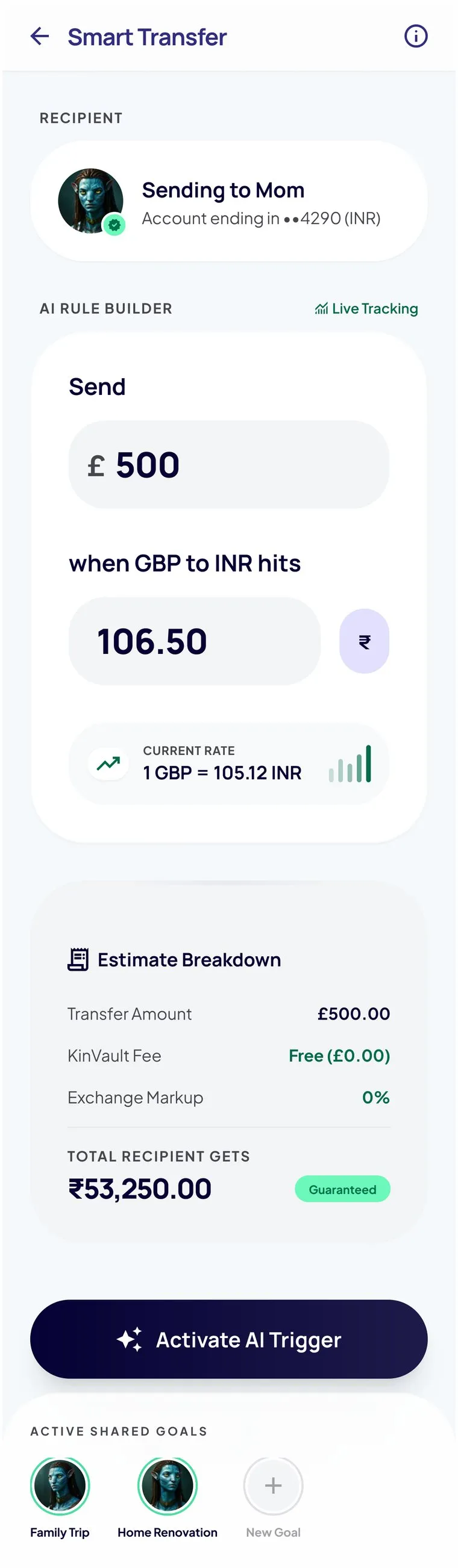
AI rate triggers
Plain-language alerts, like "best rate in 14 days", shown with the rate chart, so the user decides, not the algorithm.
"Did it arrive? Was it enough?"
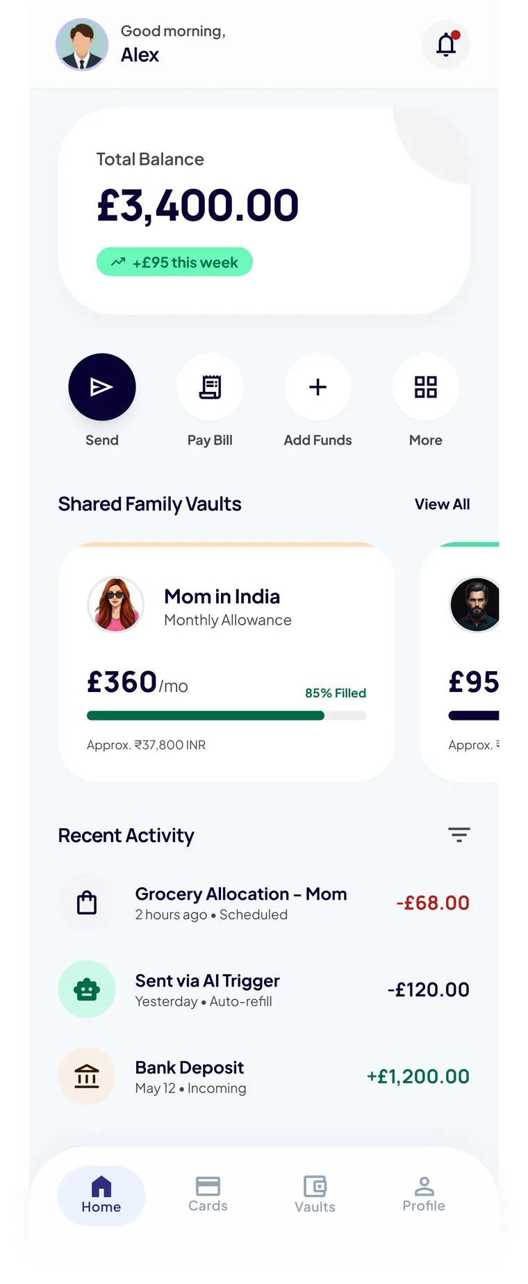
Shared vaults
Both sides see the same balance, contributors, and live transfer status, so no message is needed to confirm an arrival.
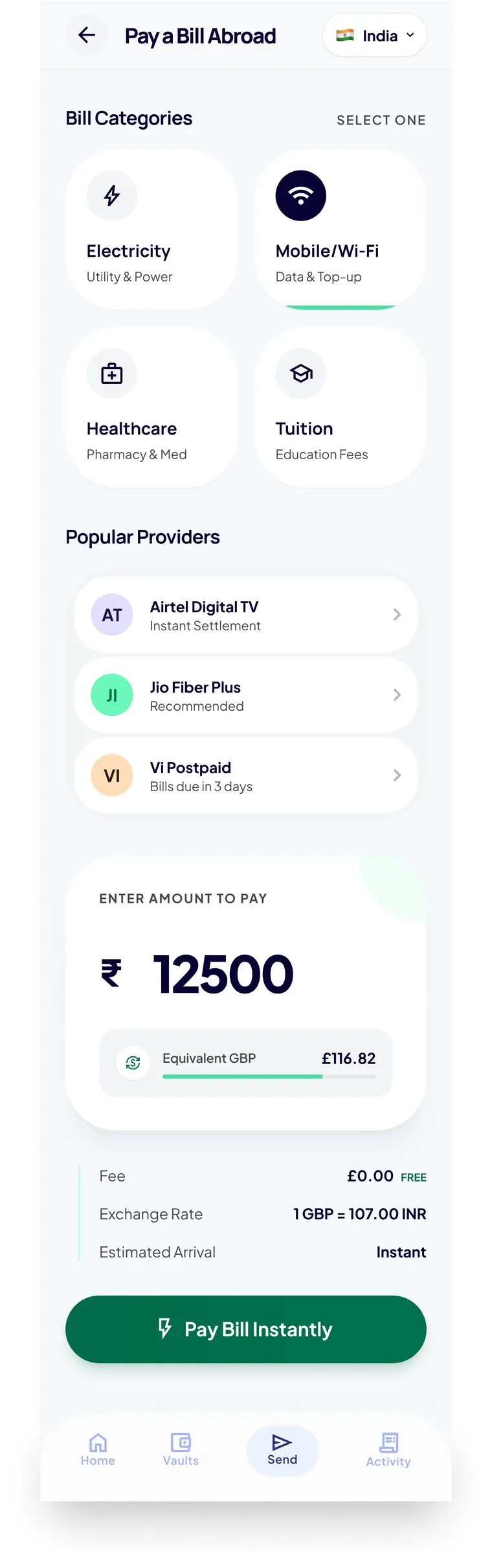
"Will the money reach the actual bill?"
Direct bill payment
Pay the utility directly. The sender sees the bill cleared, not just that money was sent.
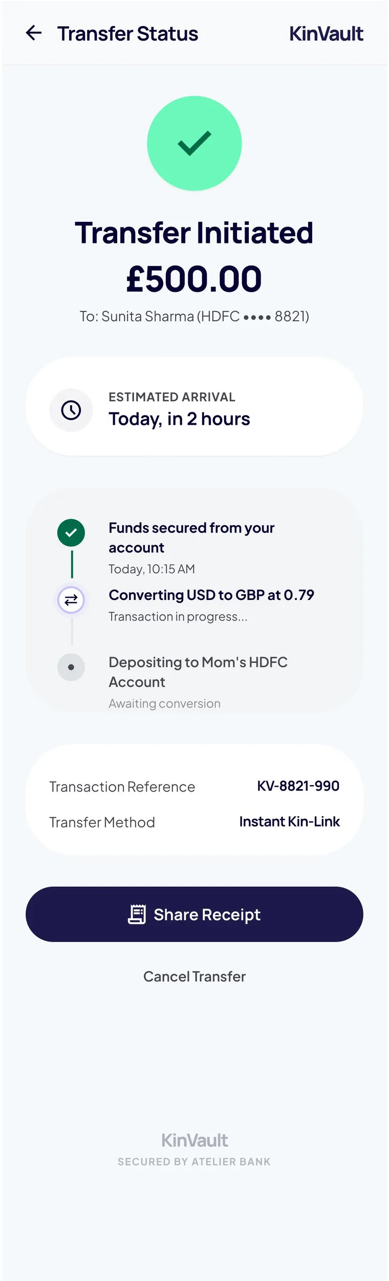
The high-fidelity prototype: the core send-money journey, from the family dashboard through to a tracked transfer.
A visual system built to feel permanent
The creative direction, "The Financial Atelier", pairs a deep heritage navy with a pearl surface and an emerald accent for growth. Manrope keeps the type quietly geometric and modern. Generous whitespace and vault-grade security cues make a fast app feel as considered and trustworthy as a private bank.
Closer than a vault. Connected like kin.
KinVault Heritage · brand hook
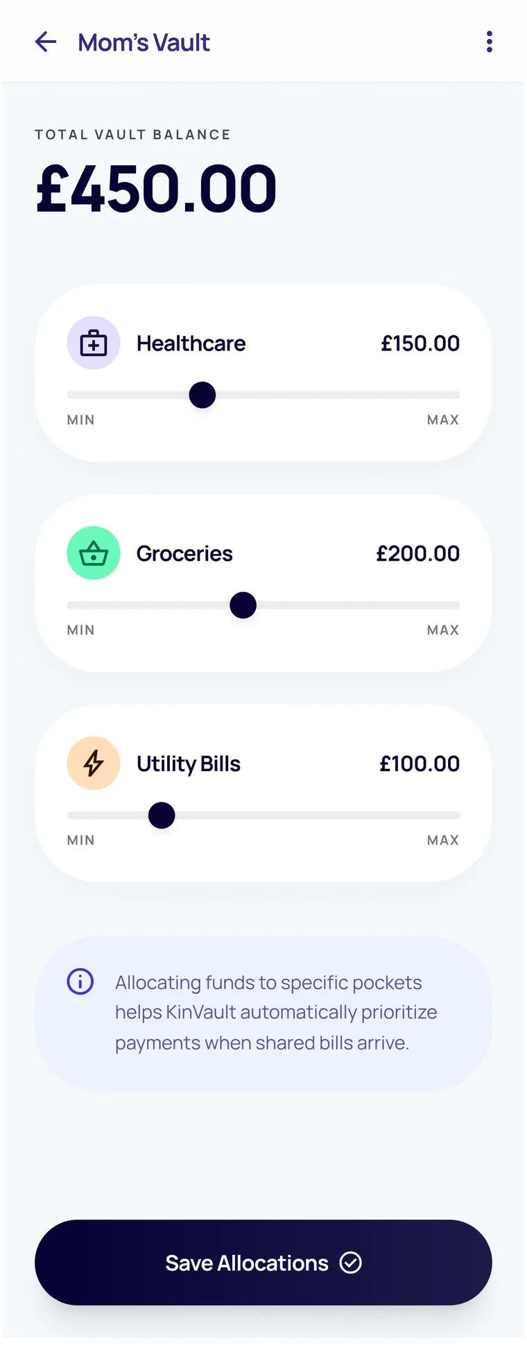
Shared family vaults
Progress indicators, contributor visibility, and activity history. Both sides of the relationship see the same vault state, which removes the need for a WhatsApp message to confirm an arrival.
Smart Transfer with rate triggers
AI-driven rate alerts in plain language. Not "GBP/INR hit 106.50" but "the best rate in the last 14 days, good time to send." Simple, user-controlled, with a clear opt-out.
Bill Pay Abroad
Pay a utility provider directly, not just a bank account. The sender sees confirmation that the electricity bill was cleared, not just that money was sent. It closes the anxiety loop completely.
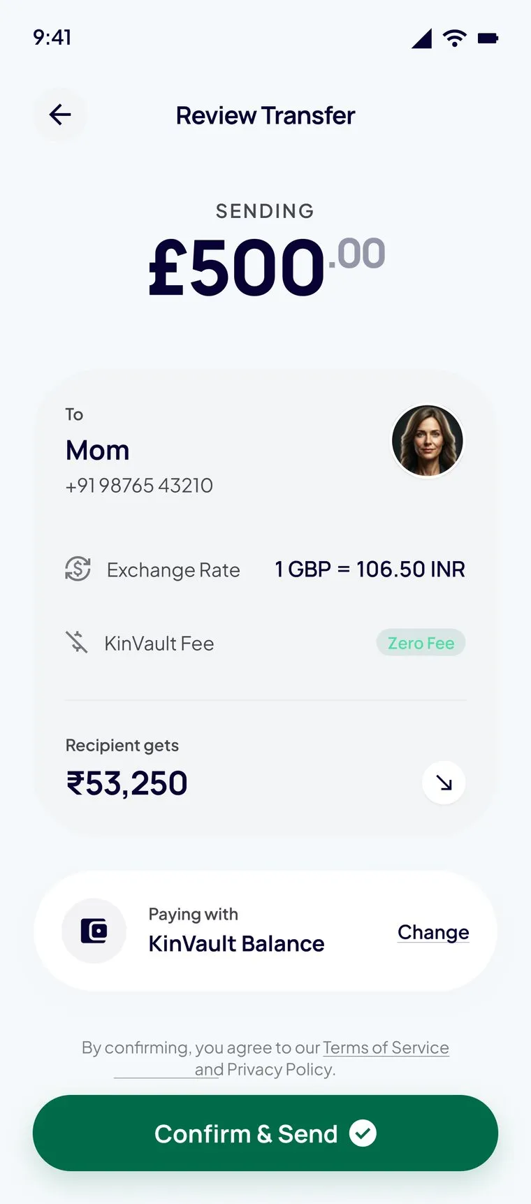
Transfer status & rate lock
Status tracking with estimated arrival, a fee breakdown shown at the decision point (not buried in confirmation), and a real-time rate lock so the figure reviewed is the figure sent.
These figures are directional, drawn from prototype testing and benchmarked against published data from comparable remittance products. For a concept project they represent targets to design against, not live results.
What this project taught me
Working on a consumer product after several years of enterprise work exposed how differently the two domains approach trust. In enterprise UX, trust comes from predictability and compliance signals. Users trust a system that behaves consistently within a known framework. In consumer fintech, trust is far more emotional. It's about whether the product feels like it's on your side.
The hardest design problem wasn't the feature set. It was tone. Writing copy that felt warm and human while communicating exchange rates and fee structures accurately took multiple iterations. The first version read like a banking app. The third read like a WhatsApp message. The final version landed somewhere in between, warm enough to feel like family, exact enough to feel like a vault.
The AI rate trigger was the most technically interesting design challenge. The first prototype version just fired when a threshold was hit, which felt arbitrary and slightly creepy. The fix was transparency: showing the 14-day rate chart alongside the trigger notification so users could see the context for themselves rather than just being told what to do.
This project confirmed something I suspected from enterprise work. The most important UX work often happens in the moments just before and just after the primary action: the anxiety before a transfer, the uncertainty after. Most apps design the middle and neglect the edges.
- 01 Home
- 02 About
- 03 Products
- 04 Knowledge
- 05 FAQs
- 06 Contact
Web Redesign · CMS Migration · 2025
Rebuilding a Process-Safety Web Presence
Web Redesign · Internship · 2020
Elevating a Design Thinking Agency
B2B SaaS · UK · 2025
UX Strategy for an Industrial Safety Platform